%
%
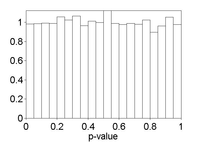
% Figure caption: Histogram of test-enhanced learning p-values
% under H0. Each p-value was computed by sampling at random the
% 60 data values under the SSSS and SSST conditions and
% arbitrarily putting them into two groups of 30 each, then
% running a t-test, as in the t-test on page 265. This was
% repeated 10,000 times. The histogram was normalized by dividing
% the number of observed p-values, in each bin, by the number
% expected if they followed a U(0,1) distribution.
drk = csvread('rk.csv');
nTestOutcomes = numel(drk)
alldrk = drk(:); % Formats data into a vector.
nPermutations = 10000;
pValues = zeros(nPermutations, 1);
for i = 1:nPermutations
shuffledTestOutcomes = alldrk(randperm(nTestOutcomes));
fakeSsssOutcomes = shuffledTestOutcomes(1:30, 1);
fakeSsstOutcomes = shuffledTestOutcomes(31:60, 1);
[h, pValue] = ttest(fakeSsssOutcomes, fakeSsstOutcomes);
pValues(i, 1) = pValue;
end
% Plot the histogram of observed p-values.
hist(pValues, 0.025:0.05:0.975)
set(gca, 'Box', 'off', 'FontSize', 20, ...
'YLim', [0, 560], 'XTick', 0:0.2:1, 'YTick', [], 'TickDir', 'out')
% Set faces to white.
meanhist = findobj(gca, 'Type', 'patch');
set(meanhist, 'FaceColor', 'w')
% Add labels and set figure position.
xlabel('p-value', 'FontSize', 20)
set(gcf, 'Position', [200, 100, 700, 500])
%% The following will rescale the y axis (as in the book) if desired (with
%% one at the true mean, rather than empirical)
axesPosition = get(gca,'Position');
% The first sets a y-axis on the left, the second copies it on the
% right.
hNewAxes = axes('Position', axesPosition, 'Box', 'off', 'FontSize', 20, ...
'Color', 'none', 'TickDir', 'out', ...
'XAxisLocation', 'top', 'YAxisLocation', 'left', ...
'YLim', [0, 1.12], 'XTick', [], 'YTick', 0:0.2:1);
hNewAxes = axes('Position', axesPosition, 'Box', 'off', 'FontSize', 20, ...
'Color', 'none', 'TickDir', 'out', ...
'XAxisLocation', 'top', 'YAxisLocation', 'right', ...
'YLim', [0, 1.12], 'XTick', [], 'YTick', []);