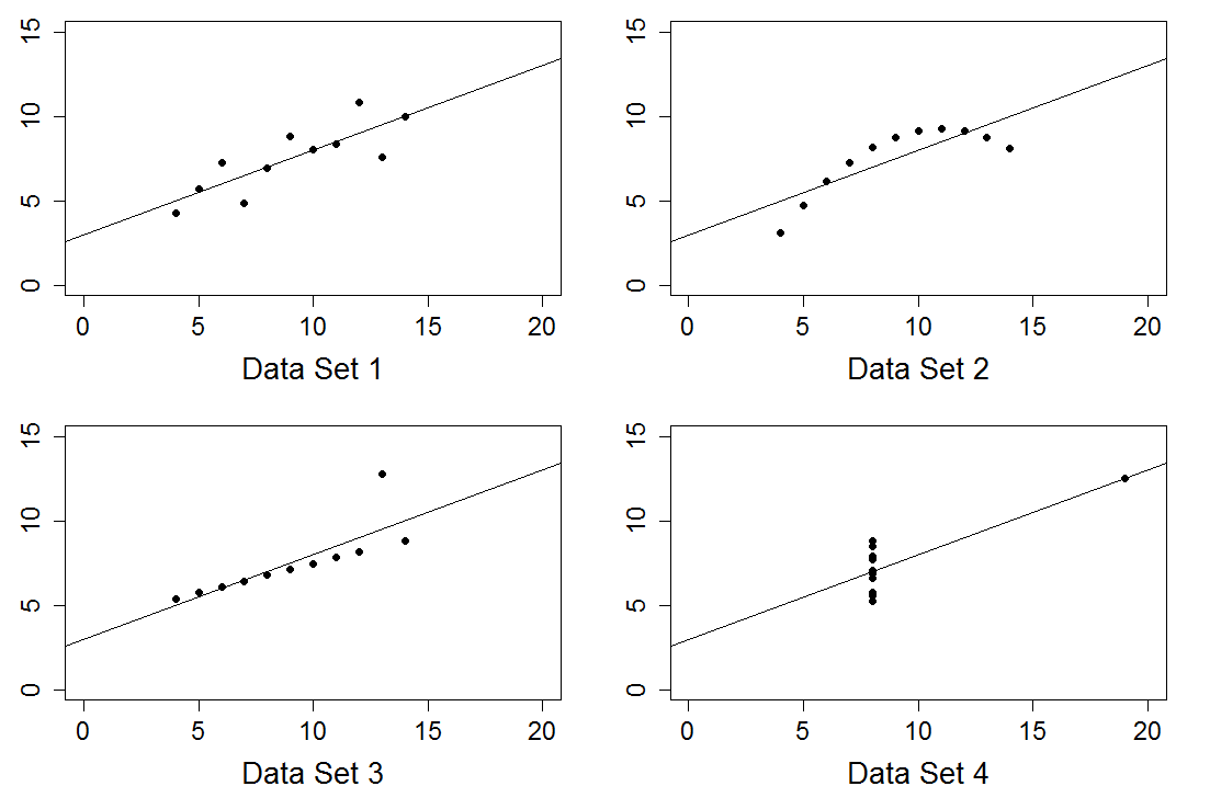
#  This script produces a plot of Anscombe's Quarter.
#  It uses the data 'anscombe' which is included in base R.
#  The 'anscombe' data set has columns
#    x1  x2  x3  x4  y1  y2  y3  y4

#  Set up the graphics device.
par(mfrow = c(2, 2))
par(mar = c(5, 3, 1, 2))

#  Set up graphical parameters.
point.type <- 16        #  16 is a filled circle.
point.size <- 1
label.size <- 1.6       #  For cex.lab, size of labels relative to points.
axis.size  <- 1.4       #  For cex.axis, size of axes relative to points.


for (i in 1:4) {

    x <- anscombe[ , i ]
    y <- anscombe[ , 4 + i ]
    sub.plot.title <- paste("Data Set ", i)

    #  Plot Anscombe's data.
    plot(x, y,
         xlim = c(0, 20), ylim = c(0, 15),
         xlab = sub.plot.title, ylab = "", main = "",
         pch = point.type, cex = point.size,
         cex.lab = label.size, cex.axis = axis.size)

    #  Add regression line.  (They'll all be the same.)
    abline(coef(lm(y ~ x)), lwd = 1)

}

#  Close the graphics device.
dev.print(device = postscript, "12.5.eps", horizontal = TRUE)